
So, you’ve sketched up a masterpiece of wooden artistry, a sublime harmonization of earth, air, fire, and water. Looks like you get to eat well this month. However, before you order that lobster thermidor, ’29 Latour, and a personal performance from Charles Aznivour, let’s just see what reality thinks, shall we?
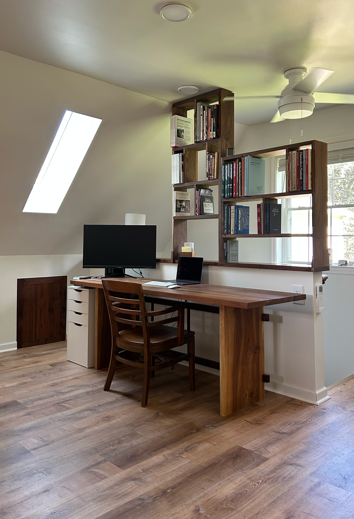
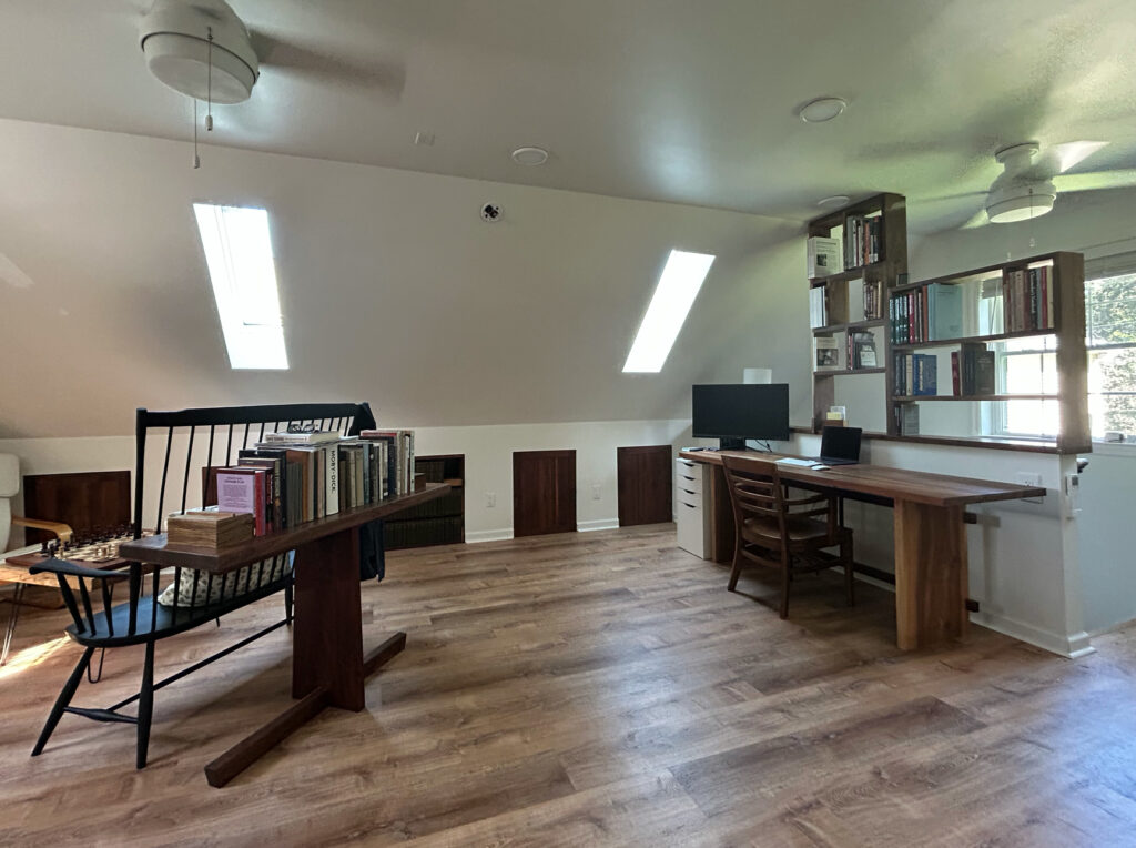
Now, the following is not an exercise in abstraction, but one about a personal project for my home office that sits above the garage. Most of the office I completed renovating a couple years ago. However, I have this half wall at the top of the stairs to prevent cases of accidental plummeting. Building codes. So practical.
My desk/workspace portion of the office sits in front of this wall, so I can look out the windows in front of me while I work one of my many jobs. I always envisioned something else on top of this wall – part architecture, part furniture, I guess. Shelving for practical reasons, a kind of screening device, a design that does not close in the space, and something to add height, depth, and a bit of focal curiosity to the space. But I was not sure what at the time so I just left it as is. A plain wall of short stature meant to prevent liability lawsuits. The wall was, though, capped with a continuous piece of 6/4 walnut to match some of the other trim pieces in the room. About 9 feet, 6 inches in length, and precisely 6 – 15/16” deep. A nice ledge. Lots of room for activities. At times, I had computer monitors sitting up there. Some other computer paraphernalia. Books. Speakers. Odds and ends.
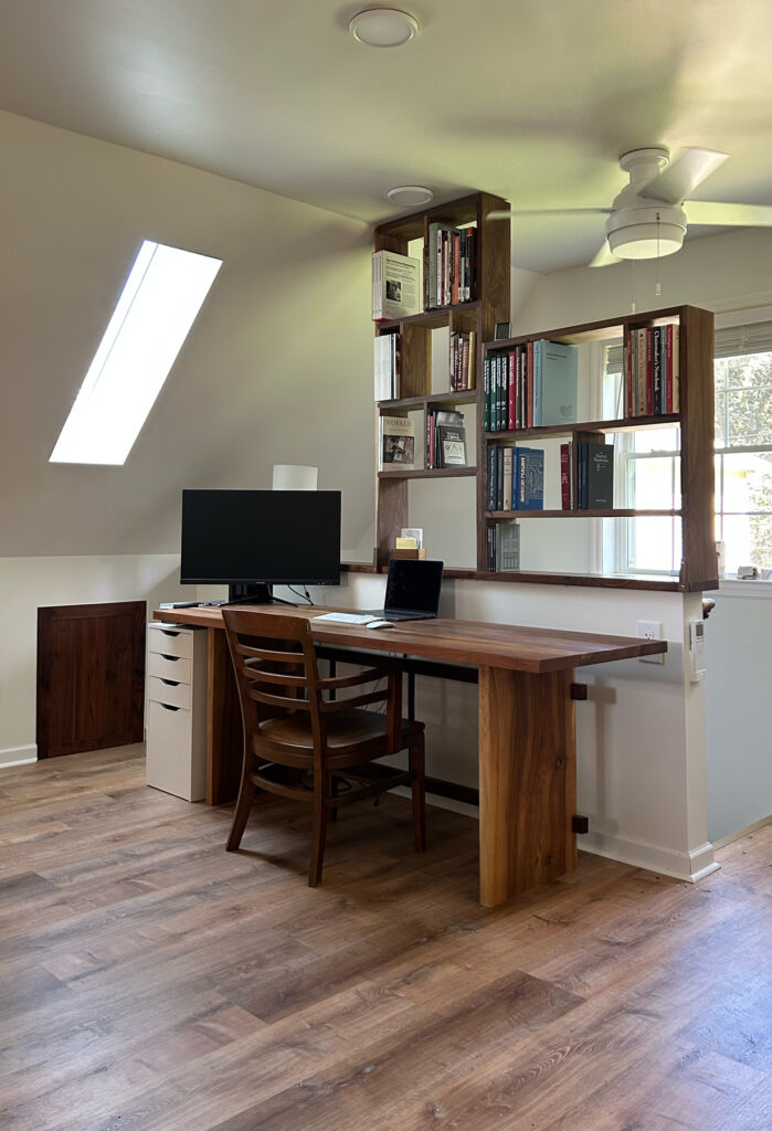
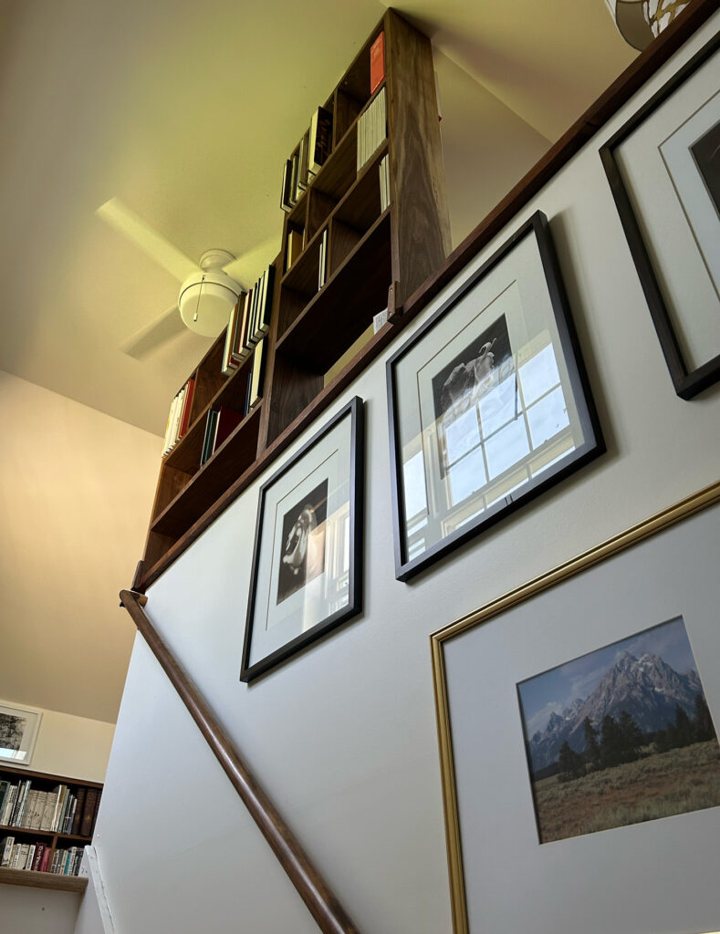
So, something with… height, something with a bit of… mass, but not too much! which is why I didn’t completely close in the staircase and add a door at the top to begin with. Light and airy. That’s my middle name. The rest of the room, how shall I say, everything kind of exists on the same horizontal plane. Knee walls, bookshelves inset into said walls, other pieces of furniture. A flat lander’s delight.
From a practical standpoint, at this juncture, I had run out space for books in the office. So, part of the dilemma was what to do about that. Because the office has two sloped ceiling sides and only 4 foot knee walls, not a lot of wall space to put furniture or shelving. The gable ends – well, one is where the stairs are, the other has a window, HVAC system, etc.
I ran through a bunch of proportional sketches. Symmetrical versus asymmetrical composition, different thickness of the components, etc.
These and ohters were MOSTLY questions that cropped up AFTER the initial idea was sketched on paper. And I thought about all of them quite a bit. Right up until the point it was installed. Maybe too much.
The first sketches were fairly easy to work out, and while the finished project mostly looks like those, a good amount changed over time – either because of preplanning or realizing, hmm, that ain’t gonna work. In my experience, these drawings confidently suggested they knew what they were talking about. This is the girl, they kept insisting.
For a while I was convinced the piece should be made from cherry, mostly because I have a sizeable inventory of 8, 6, 5, and 4 quarter on hand – all nice, clear, minimal sapwood. No need to spend more dough. Also, I think walnut and cherry can be very good companions. The thing is, the more I thought about it, the more I realized this wasn’t another piece of furniture in the room. It was going to be a part of the room itself. Every other architectural wood element in the office right now, my desk (mix of English and black walnut), the knee wall doors, bookshelves, the wall cap – all black walnut. So, I think it just had to match in this case.
More questions, more decisions. The entire assembly would have to go up stairs and require negotiating a 90 degree turn, fit beneath the ceiling (don’t forget your Pythagorean theorem here to calculate the hypotenuse length for the pivot into place if you are not lifting it straight up and in), and then be secured (semi) permanently in place. All this (and one other factor) ruled out building this as one piece. Instead, I divided it into three separate assemblies that could be carried individually, set in place, shimmed where necessary, and anchored both to the wall cap below and to the ceiling joists above. Sometimes logistics dictate design as much as aesthetics. Sometimes you get really lucky where a ceiling joist happens to be in relation to your design.
Even after I started to build the thing the design continued to evolve. I ended up changing the thickness of the partitions to be slightly narrower at 3/4. Light and airy, remember?
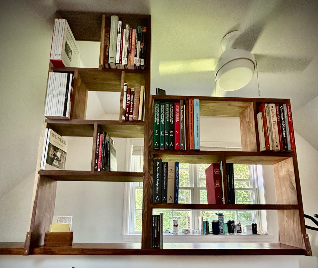
The proportions of individual openings also was something that I spent hours figuring and refiguring. For some, I considered the practicality of the tallest size of books that would inhabit this thing. I wanted a fairly large opening at the bottom to see through while sitting at the desk. I then worked out the proportions for the other shelves. They are graduated, getting wider at the top. I thought this would help make the height higher, if you will. Kind of lead your eye ever upward or some such contrivance.
Now, initially, I had the height of the right side of the unit and one of the shelves in the tall center aligned horizontally. However, when I dry fit that unit, it was too close, in my opinion, to the ceiling fan. Too crowded. Only one fix, after thinking about it for 3 hours. Chop off some of the bottom from the sides. Instantly lower. But how much? Well, I tried to make the asymmetry, the positions of the shelves on the right side assembly fall about halfway between those in the center unit. I think it works much better with the lower height. I chopped 7 inches off, taking it from 42 to 35, while the center unit remained 58 inches high. Problem solved.
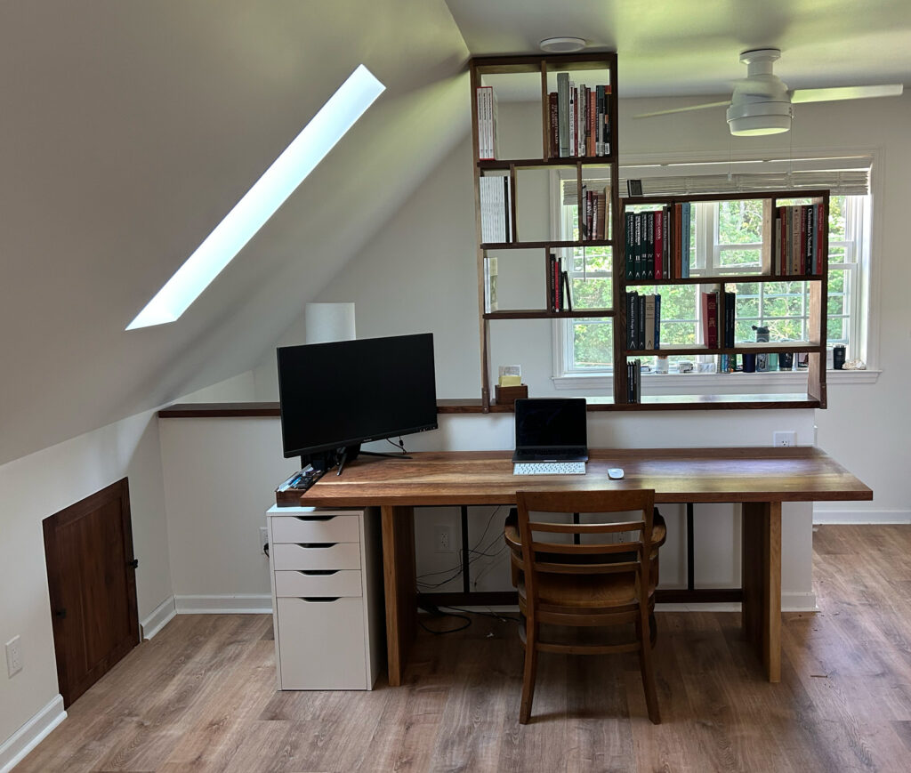
Now, the left side, following the sloped ceiling, is still evolving in terms of design as I write this. I wanted the other two pieces to be in and set before I consider it further – whether to add the final preconceived piece, or not. I’ve already built several temporary plywood infill pieces to understand how different proportions affect the remaining triangular space I have to work with. That’s the sort of thing no drawing can answer convincingly. You have to stand in the room, look at it from different angles, from the desk, sitting at the desk, from the stairs, lying on the floor, and from across the room. Initial gut reaction tells me something is going there, just not sure yet what that something is.
The finished shelving now holds my woodworking library such as it is. I actually think the best decision was to not have solid backs on this. Being able to see through it was, I think, the only way it works. While some of the books hang over the fronts/backs, it looks intentional. Ha. Because it was. I designed it that way. One other thing. One gets to experience the backs of what’s on it as you go up and down the stairs. It changes depending on your direction. Some places you can see just the paper of the books and the boards. Where the shelves are not full, you can see the covers/titles. You can even see the back cover of the one remaining record that I have in my collection after all these years – Double Nickels on the Dime by The Minutemen.
Which brings me back to the title of this article. Drawings aren’t necessarily dishonest or lying to you because that implies intention. I don’t know what kind of paper you use, but mine is just dead wood, not a malicious or malevolent spirit. Maybe it’s better to say that drawings and sketches are sometimes too optimistic. They assume the world will cooperate. The wood, though, has no such illusions or proclivity toward cooperation. Quite the opposite sometimes. Wood tells you exactly where you’re wrong, one board, one joint, or one awkward proportion at a time. If you’re paying attention, it also tells you how to use it well.

Leave a Reply